Plot Your Facebook Insights: Creating a Custom Google Map Using Fusion Tables
I find Google Maps to be very fascinating. It isn’t 100% accurate by any means, but it surely has made life easier for me. As a visual person, I like the idea of maps to put things into perspective for me.
For this project, I decided to take the Facebook page data I had recently been analyzing for my synagogue. I looked at the unique users and plotted them on a map in Georgia. Why Georgia? I’m working on a campaign to increase attendance and membership at my synagogue, so this visual information is a quick and easy way to get stats.
Here’s what I did to get this map:
First, I made about four hours worth of mistakes (there’s too many to mention).
Since this is done in Google Docs, you have to have the Fusion app connected to your Drive. Here’s what Google told me on how to do that:
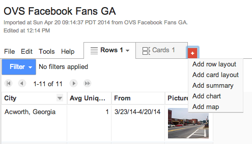
Click on this picture to take you to a tutorial on Fusion Tables
I exported the Facebook insights data to my computer. I only have Numbers on my Mac, and I got frustrated with it, so…
I created a spreadsheet in Google Docs with the average Facebook users who like my synagogue’s page. I copied/pasted from the spreadsheet in Numbers.
Like the picture above says in #7, I created a Fusion Table and chose to import from a Google Spreadsheet.
Once the fusion table is open, click to make a new tab and choose Add Map.
Nothing will show up until you make adjustments to the columns to get what you need on a map.
I went back to my fusion table and changed the City column from Text to Location.
Everything in that column was plotted onto the map. I learned – through multiple mistakes – that only the column header needs to be changed to “Location,” not every location I had listed in that column. Otherwise, I had Atlanta, GA showing up in Shenzhen, China and Athens, GA was plotted in Nigeria.
I opened the map to configure it the way I wanted it. You can change feature styles like the point icon and how the info box will appear.
I changed my icon from the small read dot to the larger red pointer. It’s easier for me to see.
Clicking on any location icon opened the information window. The URL to the picture I had chosen was showing instead of the actual picture. I looked at Google’s sample spreadsheet to figure out how to make the picture show instead of the link. I noticed that format was set to “four-line image.”
I didn’t like how the picture had the word “Picture” above it, so I tried to delete the word from the column header. Apparently, you can’t do that.
I went back to the configuration setting to change the info window. On the Custom tab, I was able to delete the word “Picture” from the HTML so only the picture would show. Success.
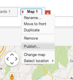
I was satisfied with the end result and was ready to publish the map.
I shared the map just like any other Google Doc. If you aren’t familiar with how to do this, see my document on Sharing Google Docs.
Now that my map is “Public on the web,” I clicked on the arrow in the map tab and chose Publish to get the embed code.
I copied the code and pasted it into this post.
Et voila! My Facebook insights of unique users in the last month have been plotted on a map.
As I mentioned in number 1, I made a lot of mistakes and created about 13 failed fusion tables before I finally figured it out. I read the Google help site on fusion tables, I studied the sample spreadsheet it provided, and I watched (and rewatched) my class from Wednesday night that walked me through the fusion table creation process. And when I did finally figure it out, it became so much easier. But without all those mistakes, I would have never become somewhat comfortable with creating a custom Google Map with data from a fusion table.
If you need a tip or two on how to import data and understand what works and what doesn’t in fusion tables, tweet me @nitzanamamane. If I know the answer, I’ll be happy to tell you.
Thank you. I was fascinated by the fusion tables and saw an opportunity to incorporate my professional project onto it. I made two more custom maps today! I could do that all day long!


Reblogged this on Religiously PR.
LikeLike
Wow, Nitzana! This is well above what you guys had to do, I’m so impressed with your effort here. Awesome!
LikeLike
Thank you. I was fascinated by the fusion tables and saw an opportunity to incorporate my professional project onto it. I made two more custom maps today! I could do that all day long!
LikeLike